17 Actionable Shop Sign Strategies That
Will Generate More Foot Traffic Today!

Imagine if you could make one simple change to your shop front signage, and see an instant boost in foot traffic to your store.

Or even better:

What if there were 17 simple changes you could make…?

…and each one of them could help you grab more of those people passing by your store every day.

You’d probably be pretty keen to see these proven strategies.

Today is your lucky day, that’s exactly what I’m going to share with you in this post.

Get More Foot Traffic: Below is a PDF checklist that shows you how to quickly execute the 17 strategies from this post for your store.

1/ Use These Simple Tactics to Increase
Sales From Your Impulse Buyers!

Would You Like Fries with That?

…ever been asked that before?

The plain simple truth is that impulse buying behaviours can amount to 40-60% of your sales.

It’s called Impulse buying because it’s unplanned.

It’s a spur of the moment action, and it occurs when a consumer feels a sudden urge to buy.

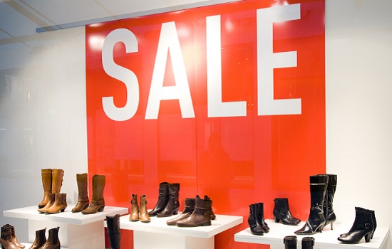
Impulse Buying Simple Tactics to Increase Sales

Fast Facts on Impulse Buyers:

  • On-Sale items account for 88% of all impulse purchases.
  • Unmarried adults with higher incomes do 45% more impulse buying.
  • People that feel angry, stressed, bored or guilty will shop more impulsively.
  • 20% of the average grocery bill accounts for impulse purchases.
  • Outside of food, the most commonly purchased item that is purchased on impulse is clothing. Wine, magazines, books, shoes, and toiletries are also common impulsive purchases.

Are you appealing to the needs of your impulse buyers?

Buyer Impulse On Sale

The purpose of your store front signage is to reach out to your customers and pull them into your store.

Whilst some stores are better suited to the urges of an impulse buyer, just about any store can employ strategies and techniques that will attract more of these types of customers.

Action: Try these quick tips to target and increase your Impulse buyers:

  • Offer a discount; an offer they can’t refuse.
  • On a hot day, are you offering them a nice cool break, with an ice cold, thirst crushing Cola.
  • Try an upsell, buy a burger and get your chips and drink for a few dollars more.
  • A Buy One, Get One offer, you buy one of these, and you get one of these at half price?
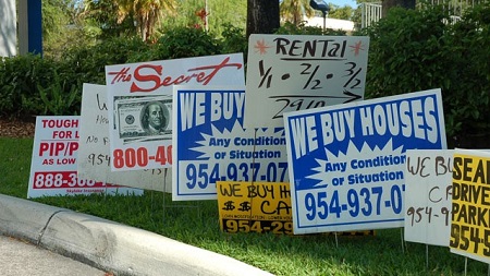
  • Make your sign simple and easy to read, you probably only have 5 – 7 seconds…
  • Make your keywords bold and stand out.
  • The colours Red, Orange, black and Royal Blue work better to attract impulse buyers.

2/ Use These Words To Instantly Increase Sales!

The best thing about words is:

They are free…

The bad thing about words is:

They are everywhere…

Not to mention there’s over 600,000 of them in the English language,

So trying to find the right words to use may seem a little daunting.

Don’t stress, I’ve got you covered.

According to Copywriter, John Kuraoka, the best way to figure what words to use is by following this simple technique:

Your sign should do two things:

    1. Talk directly to your customer.
    2. Make them a Relevant offer.

Talk directly to your customer;

You do this by using the words You or Yours…

The YOU Word

These words will help you form an instant connection with your customers.

On the other hand, avoid using words like We or I.

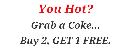
For example, if your sign said something like this:

Grab a Coke Sign

You could change it to something that connects with your customer, somthing like this…

You Hot Coke Sign

Make them a Relevant Offer;

We already know that On-Sale items account for 88% of all impulse buying behaviour,

So try using the most popular and successful words buyer words in your offer:

    • On Sale.
    • Buy Two, Get One Free.
    • 20% off Storewide.

Try using these trigger action words:

    • Now – this will create a sense of urgency.
    • New – everyone loves to have the latest and the greatest.
    • Quick – motivating your customer to act.
    • Bargain – no one likes to miss out on a bargain.

Let’s take another look at our previous example:

You Hot Coke Sign

You could create a sense of urgency by changing it to this…

Thirsty for Coke

Or try adding an offer they can’t refuse, to make it something like this…

You Thirst Coke Sign

Action: Check to see if your sign is the most effective that it can be:

  • Is your sign speaking directly to your customer?
  • Is your sign using words that are relevant to your customers?
  • Is your sign using the on-sale or urgency trigger action words?

3/ Use Decorative Acessories To Draw Attention

You want to get heads turning?

You’ll have to be creative, but don’t worry it’s not as hard as it may seem.

Let’s take a look at a couple of examples:

Here’s a Romanian bookstore that found a novel way to appeal to its target customers…

It just goes to show you that you don’t need to spend a lot of money.

Decorative Accessories to Shop Windows

On a busy retail location this would get passer-by’s talking.

Imagine how many booklovers would have been impressed with this decorative window.

Better still, which store is going to stick in their memory the next time they want to go searching for a new novel.

Try and find creative ways of incorporating your business products or services into your creative signage.

Check out this creative idea from Hugo Boss…

Window Display Ideas

Is that a real guy?

Well it could be, but it makes more sense to have a nice looking mannequin standing outside your store rather than one of your employees…

Nice touch with the Neon signage to reinforce your brand or message.

Take away the mannequin and it makes a great opportunity for a Facebook selfie.

You’d also get a few motorists slowing down to get a better look.


Action: Check to see if your sign is drawing attention:

  • Does your sign catch your eye?
  • Does it draw your attention?
  • Would it stick in your customer’s memory?
  • Does it relate to your business?
  • Does it help you to sell more stuff…?

4/ Get Your Customers Talking By Using These Tactics

People love to share stories,

Your sign could be one of them…

Word of mouth is like getting free advertising,

People are telling other people about your brand or products, sounds like a good deal, right?

…it gets better.

Customers that have been referred to your business tend to spend more based on a word of mouth recommendation.

So what can you do with your shop sign to get people talking?

Make it memorable;

Memorable Signs

Here’s a few tips on making your signs more memorable…

Your Voice, your personality is unique;

  • There’s no-one else like you.
  • Speaking to your customers in your own voice will help it to stand out.
  • Make it colourful, exciting, and interesting.
  • Take a boring subject and make come to life.


Tap into Your Customer’s Imagination;

Get your customers thinking just how good your products are.

And, more importantly how it would make them feel by owning one of your products;

  • How would it make them feel?
  • How would it change their day, their life?
  • What would people think of them?

Tapping into the deeper thoughts of your customer can help to create a memorable bond.


Paint a Picture;

Make your sign visually descriptive;

Using words and images to paint a picture in your customer’s mind, getting them to see how they would benefit from one of your products.

Will it make them more comfortable, popular, richer, or happier?

Using words that describe the benefits, will help to draw these images in your customer’s mind.


Action: What simple changes can you make to get people talking about your products?

  • Can you sign be made more colourful, exciting or more interesting?
  • Does your sign capture the imagination of your customers?
  • Does your sign use the right words or images to paint a picture in your customer’s mind?
  • Does your sign make your products come to life?

5/ Add A Touch Of Magic To Your Shop Front Door!

Want more people walking into to your store?

then make your store more inviting…

When your kids have a birthday party, they send out invitations, and all the kids come…

so, when people walk past your shop, why not invite them in?

Here’s a few simple, fast track tips to make your shop more inviting…

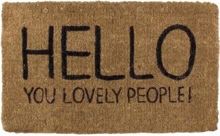
Get a Welcome Mat!

Hello Mat

When you visit someone’s home, the front door is the usually first thing you see before entering a house.

It tells a you a lot about the people who live inside, and…

…It can make a good or bad impression before even meeting the people.

First impressions are important…

…having a warm and inviting greeting out the front of your shop is an easy to make a friendly impression without spending a fortune.

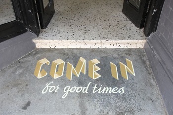
Floor Graphics

Open door

Floor graphics are a great marketing technique for the floor space in front of your shop front door.

You’ll definitely catch the attention of customers walking past your store.

Make it catchy, give them an offer and you’ll be amazed at the number of people who enter your store.

An Open Door

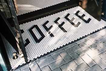
Coffee Door Mat

You can generate more walk in traffic with an open door.

More people will naturally walk through an open door.

An open door allows your customers to see inside your shop more easily.

It provides easier access for parents with strollers, elder or disabled people will thank you and they won’t be struggling to get inside.

It’s also good sign that your open for business, ever walked past a store and wondered if they were open?

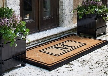
Dress Up Your Front Door

Invite People into your shop using Floor Mats and Signs

Want to impress even more, try some planters and a well-groomed mat.

If you’re looking to impress your customers, then why not try a to dress it up a little…

Here’s a great example of a sophisticated, contemporary and elegant design that will impress your customers as they walk on by.

Action: Spice up your shop front door:

  • Grab a welcome mat for your shopfront door?
  • Consider a catchy message or offer for the floor outside your front door or shop?
  • Try opening your door more often and see if more people walk in?
  • Tidy up the front door with a new lick of paint, some planters and a nice new mat?

6/ Use Your Signage To Target Both New & Regular Customers!

You might not realize this;

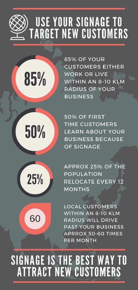
But most of your customers live or work within an 8 – 10 kilometre radius of your business.

Not only that;

But approximately 20% of the population relocate every 12 months.

So what does that mean to you?

Well, it means that if you’re not attracting new customers, your regular customers will slowly start to disappear.

Signage to Target New Customers

In a survey conducted by Signtronix, it was found that nearly 50% of first-time customers learned about the business because of its sign.

The best way to attract new customers on a regular basis is with signage.

It’s by far the quickest, easiest, and most economical way to build your business.

Did you know that a local customer living within an 8 – 10 kilometre radius of your business, will drive past your shop on an average 50 – 60 times per month.

With a highly visible and effective sign;

  • You will build your brand more quickly.
  • You’ll attract new customers, locals that are new to the area.
  • You will become top-of-mind when your customer needs your product.

Action – Check to see if your sign meets the following criteria:

  • Does your sign appeal to new customers?
  • Is your brand recognizable and clearly displayed?
  • Does your sign encourage, entice and invite new customers to purchase from your store?
7/ If You're Not Using the Right Colours, Your Probably Losing Customers!

The most important aspect of colour design with your sign is;

Contrast…​

The contrast between the foreground and the background is vitally important.

Take it one step further, it’s the contrast between your text and background colour.

Get it right and you attract more new customers…

Get it wrong and they’ll walk right past.

So why is that?

It needs to be visible…

Your message needs to stand out

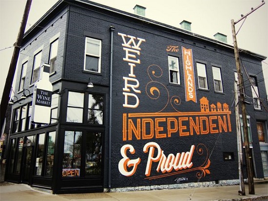
Signs that stand out...

Like with many things in life, it’s the simple things that work the best, for example;

  • Using a light colour font on a dark background, or;
  • Having a dark coloured font on a light background.
  • Keeping your font simple will help…
  • Avoid using lightweight fonts as they tend to fade into the background, whereas bold fonts may be too overpowering.
  • Regular to medium weighted fonts are the best option for a clear and legible sign.

For example, the team at Design Work have put together a number of examples;

BLACK BACKGROUND/COLOURED TEXT

BLACK BACKGROUND with COLOURED TEXT

For maximum impact,

…the black background with coloured lettering stands out the best.

It’s important to pick the right font, too small or light and it will appear washed out on the strong background.

Great for building authourity, for example security or protection services.

Can be used in a busy, overcrowded area as it will stand out very well.

WHITE BACKGROUND / COLOURED TEXT

WHITE BACKGROUND with COLOURED TEXT

Looking to portray perfection?

A white background allows you to work with just about any colour as a foreground, just be careful with the contrast as it may absorb darker lettering.

Go with a lower contrast lettering for best results.

Implies simplicity, sanitary, cleanliness and safety, for example bathroom, kitchen, technology and health related services or products.

RED BACKGROUND / COLOURED TEXT

RED BACKGROUND with COLOURED TEXT

Great for impulse buyers, it’s their favourite colour…

Red background with a black, white or yellow text is a great combination that will stand out in any crowd.

Using the colour red encourages buyers to take action!

Associated with emotions such as passion,

Associated with messages such as, warning, on-sale, and danger, it elicits emotions such as passion, desire, and energy, and great promoting food, appetite, desire and speed related products or services

YELLOW BACKGROUND / COLOURED TEXT

YELLOW BACKGROUND with COLOURED TEXT

Stands out well in most environments!

Having a yellow background catches the eye and is often used in point of sale situations because it is very effective.

Commonly used as an informational colour, you see it being used for traffic signs, airports, and public spaces.

When used with other bright colours is good for promoting leisure items, children’s toys. It implies fun, sunny, outdoors, excitement, and entertainment.

BLUE BACKGROUND / COLOURED TEXT

BLUE BACKGROUND WITH COLOURED TEXT

This will help you to build trust, dependability and honesty!

Blue is used heavily in the corporate world, and works best with a high contrasting text.

It’s a great all-round colour that can be used with health and wellness services, airlines, air-con, technology companies, water, recreational, and outdoor services such as boating, fishing, and skiing.

Doesn’t work well with food related services or products as this colour is not naturally associated with food.

SILVER BACKGROUND / COLOURED TEXT

SILVER BACKGROUND WITH COLOURED TEXT

Enhance your brand…

Silver is a colour that oozes modern, sophistication, innovation and high tech.

Works well with most foreground colours and can be used with some great metallic type surfaces.

Is commonly used for office signage and nameplates. Also works well with businesses promoting high tech, quality appliances.

Black foreground colour is very popular, creates style and professionalism.

Action – Check the colours of your sign to see it stacks up:

  • Check to see if your sign is clear and visible from a distance?
  • Is your sign easy to read from distance?
  • Does your sign stand out from all the other signs around your shop?
  • Are the letters on your signage the right size?
  • Does your sign display content that is legible?

8/ Make Your Sign Sparkle To Create An Awesome First Impression!

You’d be surprised at what people think.

People like things to be clean…

So it’s important to have clean windows, nicely swept foot path, clean doors and even a clean sign.

A fresh looking sign says a lot about the people that run the business…

Broken Shop Signage

Keep your sign looking good…

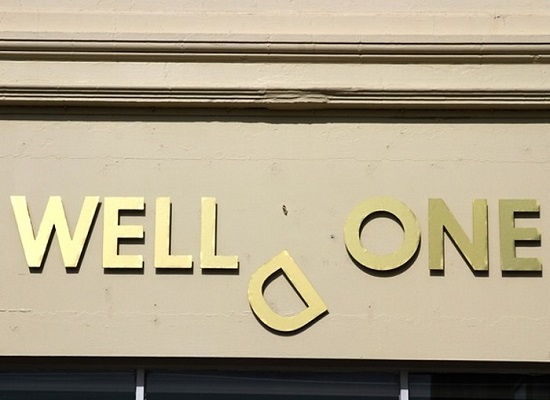
…missing letters, peeling stickers or vinyl, or broken brackets, frames or boards should be fixed up.

Action – Check your signage for wear and tear:

  • Does your signage require a fresh coat of paint?
  • Is your sign clean, and free of cobwebs?
  • Are the letters peeling or falling off?
  • Is the frame of your sign in good working condition?

9/ Get a Sidewalk Sign

If you don’t have a sidewalk sign…

…drop everything right now and go and get one!

Of course you will need a sidewalk to put it on,

And then you’ll need to know “what to say”

Well that’s easy…

Try these couple of tricks!

Use what the journalist call “Headline Text”

It’s a simple message that carry’s a punch line, and better still,

It should include a Call to Action:

By using words that urge your customers to TAKE ACTION will dramatically increase the effectiveness of your sidewalk sign.

Sidewalk Signage

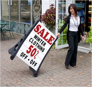
Let’s take a look at this example:

The Headline – 50% OFF SALE.

The Sub Headline – WINTER CLOTHING.

The Call to Action – Act Now and You’ll Get 50% Off.

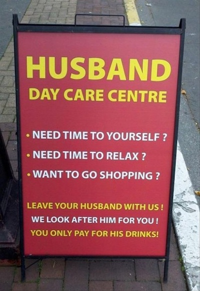
Add a touch of humour!

Funny Sidewalk Sign

Many of the most successful marketing campaigns are funny…

Your customers like to be entertained…

…the good thing about funny signs, is that people do pay more attention to them.

The important thing to remember when adding humour to your sidewalk sign is;

  • Don’t be obnoxious.
  • Emphasize the positives.
  • Not everyone will find your jokes funny so aim to appeal to your target audience.
  • Humour works best for products that are relatively inexpensive or consumable.

Action – Grab the attention of everyone that walks past your store:

  • Can you include a “Headline Text”?
  • Do you have a sidewalk sign outside your store?
  • Can you try adding a touch of humor?

10/ Include Social Media and Get Your Business Working 24 x 7!

Just because your store is shut…

It doesn’t mean that your customers aren’t looking for your products or services.

A great way to grow your business is to;

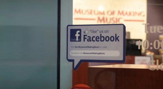
Have your social media details clearly displayed on your signage.

Social Media on Shop Window

…your customers have a mobile phone in their pocket and they use them all the time.

Popular social media platforms are a great way to reach your customers when you aren’t open for business…

…so, by having a sign out front, you can tell them where to find you…

Action – Check to see if your sign is encouraging customers to find you on social media sites:

  • Does your store tell your customers where to find you on social media sites?
  • Does your signage encourage your customers to find you online?
  • Are your social media sites speaking to your new and existing customers?

11/ Put Your Sign Where More People Will See It!

Where’s the best place to put your sign?

That’s easy:

Where more people will see it.

Try These Simple Steps.

Jump in your Car…

If your store is on a busy road:

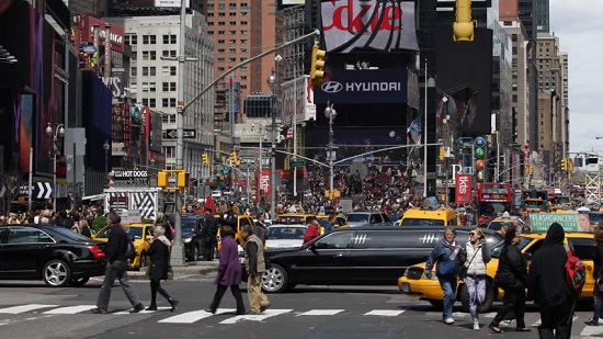
Busy Pedestrian out front of shops

Take a drive around the block in both directions looking for the most visible spot to put your sign.

Make a list of the options.

Take a look at other shops in your area, where are they putting their signs?

Make a list of all the different types of signs.

Which ones stood out the most?

Tell your customers where they are heading

Make a note of the time it takes to drive past your store in busy traffic as well as fast moving traffic.

This will tell you just how long will your customer has to read your sign, make a note of the time.

  • How many seconds in slow moving traffic?
  • How many seconds in fast moving traffic?
  • Traffic lights out the front, even better…

Give your motorists something to look at…

How far away will they see your sign?

Have someone in the car take photos of your shop, you can print these out so you can draw a mock-up sign or two.

How big or small will you need to make your words?


Go for a Walk…

Same as above, this time on foot.

Walk past your shop in both directions.

Take a walk around the block in both directions looking for the most visible spot to put your sign.

Make a list of the options.

Take a look at other shops in your area, where are they putting their signs?

Make a list of all the different types of signs.

Which ones stood out the most?

Make a note of the time it takes to walk past your store in busy traffic as well as fast moving traffic.


Action: Work out the following:

  • How long will your customer have to read your sign, make a note of the time.
  • Does your store get a lot of foot traffic?
  • Does your store get a road traffic?
  • Do you have a prominent area that’s not being used at all?
  • Where is your sign going to go?

Wall, Window, Awnings, or Footpath?

If you have a wall above of beside your shop, this might make a great position for your sign.

Creative Wall Signage

…not so lucky;

  • Shop Windows are great, but you want to be sure that you get maximum exposure…
  • Awnings are awesome, and a great way to freshen up your shopfront.
  • Foot paths are a must, and work even better when blended with your Window or Wall signs.

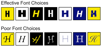
12/ How To Ensure Your Sign Is Easy To Read By Using The Best Font!

The best font to use on your signage is;

One that reads quickly…

Every second counts, in fact the average amount of time that people get to read your sign is 3 – 5 seconds, so your sign needs to have a font that is easy to read.

Effective vs Poor Font Choices

So just how do you make sure your sign is easy to read?

  • Minimize the colour.
  • Stick to the most common and popular fonts, these are tried and tested.
  • Try to stick to one font.
  • Use no more than two different fonts.
  • Aim for high contrast colours.
  • Correct sizing of font is important so that your sign can be read at distance.
  • For roadside outdoor signs aim to keep your word count at a maximum of seven words.
  • Don’t overdo the bold, italic and underline of your font, it’s OK to use Bold but keep it to a minimum and only on the important word or phrase.
  • Avoid script, novelty, and cursive fonts.
The Use of Too Many Fonts is Bad

The top 7 most popular fonts used are;

  1. Helvetica
  2. Futura
  3. Grammond
  4. Bodoni
  5. Frutiger
  6. Trajan
  7. Franklin Gothic

Size your font appropriately…

Rule of thumb is that you make your font approximately 2.5 cms / 1 inch for every 3.0 metres / 10 feet of visibility for your target audience.

For your target audience to read your sign clearly the letters need even spacing.

Heavy fonts become unreadable at distance as they blend together.

Light fonts are also hard to read as they can fade into the background.

Action: Check to see if your sign is easy to read:

  • Is your sign easy to read from a distance?
  • Is your sign using high contrast colours?
  • Does your sign have too many words?
  • Is your sign using a more popular font?

13/ Using Signage To Build Your Brand!

Does your customer know when you are?

Open for Business?

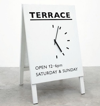
Does your store signage display your trading days and hours?

How about…

  • Your trading or business name.
  • Your contact details.
  • Your website address.
  • Your Logo.
  • Your Social Media details.
Display Hours of Business

Not only is it important that you have it displayed, but it’s also just as important to have the correct information.

Wrong opening times will confuse and annoy your customers.

Incorrect contact details may result in lost business or sales.

Building brand awareness is critical for growing your business…

Did you know that your logo is one of the most important aspects of your brand.

Does your store have a slogan, a tag line or a catch phrase?

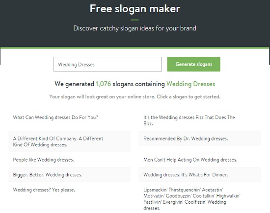
If you don’t have a slogan, why not try this helpful Slogan Generator?

Free Slogan Maker

Action: Does Your Sign Help to Build & Grow Your Brand?

  • Are there any typo’s in your sign?
  • Do you have your logo clearly displayed?
  • Are all your store & business details on display in your signage?
  • Is your slogan on display in your store signage?

14/ Use This Secret Technique To Test Your Sign...

If your about to spend your hard earnt money on a brand new sign;

You’ll want to make sure it works.

If you’d like some help with what to write on your sign, you could try this technique;

It’s basically a tool that helps test your headline.

Headlines are usually associated with newspapers and magazines, but there’s no reason why you can’t use the same technique to help designing your new sign.

Basically, you want the words on your sign to be as effective as possible.

There’s no better experts at writing good, effective content than the journalists.

So, let’s use the bridal gowns as an example;

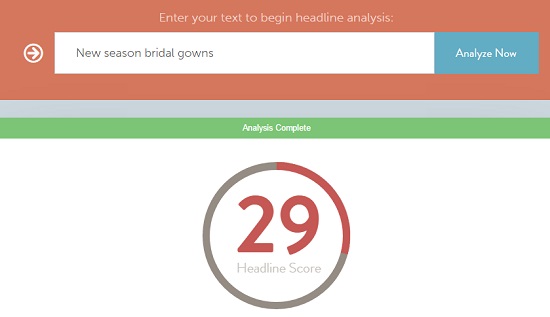
We type in our sign content like this…

Bridal Gown Example 1

Using this great little Headline Analysing tool and we can see that our first attempt gets a score of 29…

You can access this online tool by Clicking Here.

Not bad for a first attempt,

But we can do better…

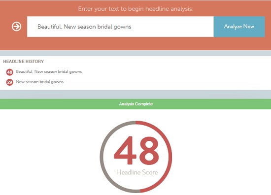
So, we add another power word with something like this, and straight away we boost our score up to 48…

Bridal Gown Example 2

It’s that simple…

Try it with your product or service

Mix it up and see what you can come up with…

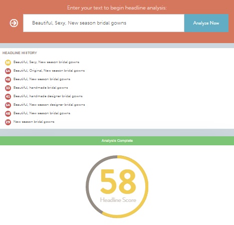
Here’s a few more Bridal Gown examples that score a little higher…

Bridal Gown Example 3

Action: Improve your Signage Headline Effectiveness:

  • Enter the words or headline from your sign into this testing tool.
  • Try adding power words to improve on your score.

15/ Light It Up...

Illumination…

Illuminated Signage for Lightbox

It can have a huge impact to the appearance and effectiveness of your sign…​

​For example, it can help to grow your brand;

  • Your sign can be visible 24 hours a day.
  • It will stand out at night, helping you to get the edge from your competitors…

Essential for any type of business that is trading after hours​.

Illuminated Signage to Attract Customers

Action: Can you be seen day and night?

  • Is your signage visible during the night?
  • Would an LED light in your shop window improve the marketing of your products or services?
  • If your business is trading after hours, is your signage easy to see at night?
  • Is there an important piece of information that you would like to illuminate, such as a special offer or pricing?

16/ Keep It Simple... and You'll Convert More Customers!

Less is More…

…a phrase adopted by 1947 by architect Ludwig Mies van der Rohe as a precept for minimalist design.

Taking the same approach with your signage can lead to an impressive boost in customer conversions…

Simple Signage is Effective

According to an article here;

There are many benefits to keeping things simple…

For starters,

Simple designs are considered the most beautiful…

And beautiful things convert better.

How, you might ask?

The brain prefers things that are easy to think about.

The easier your signage is to process visually, the more appealing it becomes.

Why is that?​

Well, it comes down to a scientific conclusion that the less complex a sign is, the less work is required for our eyes and brains to process and store the information.
Simple Signage Gets the Message Across to Customers

But that’s not the only reason why it pays to keep things simple…

There’s also a thing called your working memory,

It’s a part of your brain that temporarily stores information.
Unfortunately the working memory can only effectively store 5 – 9 pieces of information at a time.

A simple, well designed sign penetrates your customers working memory much better…

…which helps your customer remember important elements about your brand…


Action: Is your signage simple:

  • Is your signage too complex?
  • Are there more than the recommend 5 – 9 pieces of information on your sign?
  • Is your brand well represented in your signage design?
  • Does your signage include the most important elements about your product, service and brand?

17/ Learn From The Experts - These Companies Spend Millions on Their Ads...

If you want to think outside the box…

Try this;

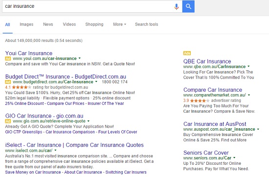
Type your keyword into Google, like this;

Google AdWord Tester

If you want to how to get people’s attention, just look at the Ads.

Although these ads are written specifically for the search engines and designed to get people clicking on their ads…

It doesn’t stop you from borrowing from their ideas.

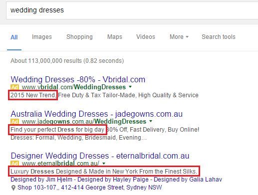
Say you have a shop that sells Wedding Dresses,

You type in your keyword into Google and you get something like this:

Google AdWord Tester is an Effective Online Tool

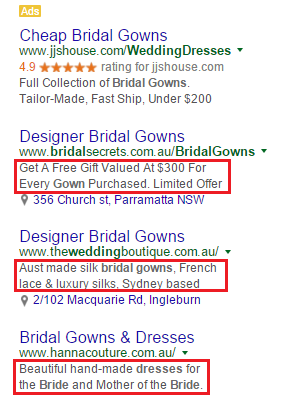
Try another similar keyword, this time you type in Bridal Gowns;

Try Another Similar Keyword

Starting to get the idea?

These catchy little ads can help you with some new ideas for your shop signage.

Take it further and type in some extensions to your keywords like, “on-sale”, “cheap”, “best” and see what the search results present.

Action: Get Some Fresh Ideas:

  • Type into Google a relevant keyword for your business.
  • Check the Ad listing for new product descriptions.
  • Try adding extension keywords such as best, cheap, on-sale.

Click Here to download a PDF checklist that shows you how to quickly execute the 17 strategies from this post for your store.


“Signage is my passion, to be able to  work with my clients and share my personal artistic perspective as well as my professional and commercial experience, to meet their marketing requirements…” – Kasey Sealy